Five Ways to Display Art in an Exhibition
No two art museums are exactly alike. Even institutions that specialize in the same era, artists or culture vary in methodology and mission. However, the ways in which artwork is displayed have become rather standardized over the span of art history. There are, of course, certain museums and galleries that deliberately defy conventional exhibition methods in favor of a more post-modern approach. This choice can be driven by conceptual objectives, or primarily by aesthetic motives (the rise of interactive museums designed specifically for Instagram appeal comes to mind).
But, some methods have stood the test of time…and for good reason. Here, I will explore five ways in which is art is commonly displayed in museums and galleries. Next time you visit an art space, take notice of how works are displayed and consider what their arrangement may communicate.
1) White Cube
© Dannie Jing
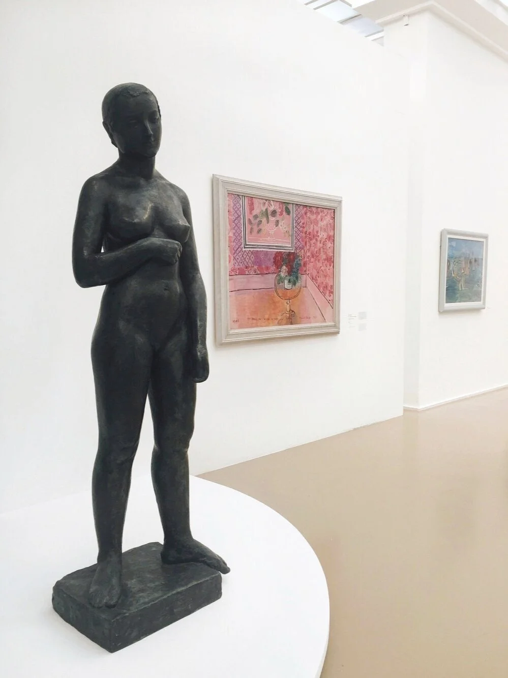
Today, this is the most widely adopted model for configuring spaces in art museums and galleries. According to the Tate glossary, the white cube refers to a “certain gallery aesthetic characterized by its square or oblong shape, white walls and a light source usually from the ceiling.” It emerged alongside the rise of the abstract expressiont and minimalist movements in the later half of the 20th century. The walls and pedestals are a pure, flat white. The room is bright and evenly lit. Artworks are either unframed or in simple, understated frames. Wall text—if any—is purposeful, concise, and unobtrusive. The white cube provides a neutral environment that puts the spotlight on the art. Instead of closely congregating artworks, works are spaced to facilitate isolated moments of observation, emphasizing the individual significance of each work.
2) Salon Style
© Maxim Mitsun
This display style consists of artworks closely grouped in a mosaic-like arrangement, with pieces ranging in size positioned at varying heights, including above and below eye level. Picture the rooms at the Louvre in Paris or the National Gallery in London. This was a dominant method of art display up until the 20th century—first introduced in the late 1600s at the prestigious Paris Salons, the highly-regarded annual showcase for the most esteemed art of the year. Paintings were organized this way simply because it allowed for the largest number of works possible to be included and viewed in a single space. Artworks are ornately framed, often engraved with the artist’s name for public recognition. A common hierachy developed in which paintings deemed more significant were placed higher up on the wall, ensuring their visibility even in a crowded room. Today, this display style is often associated with (but not limited to) neoclassical collections, religious paintings or portrait galleries, reinforcing a collection of works with a distinguished and ceremonial essence.
3) Archival Display
© Nikitich Viktoriya
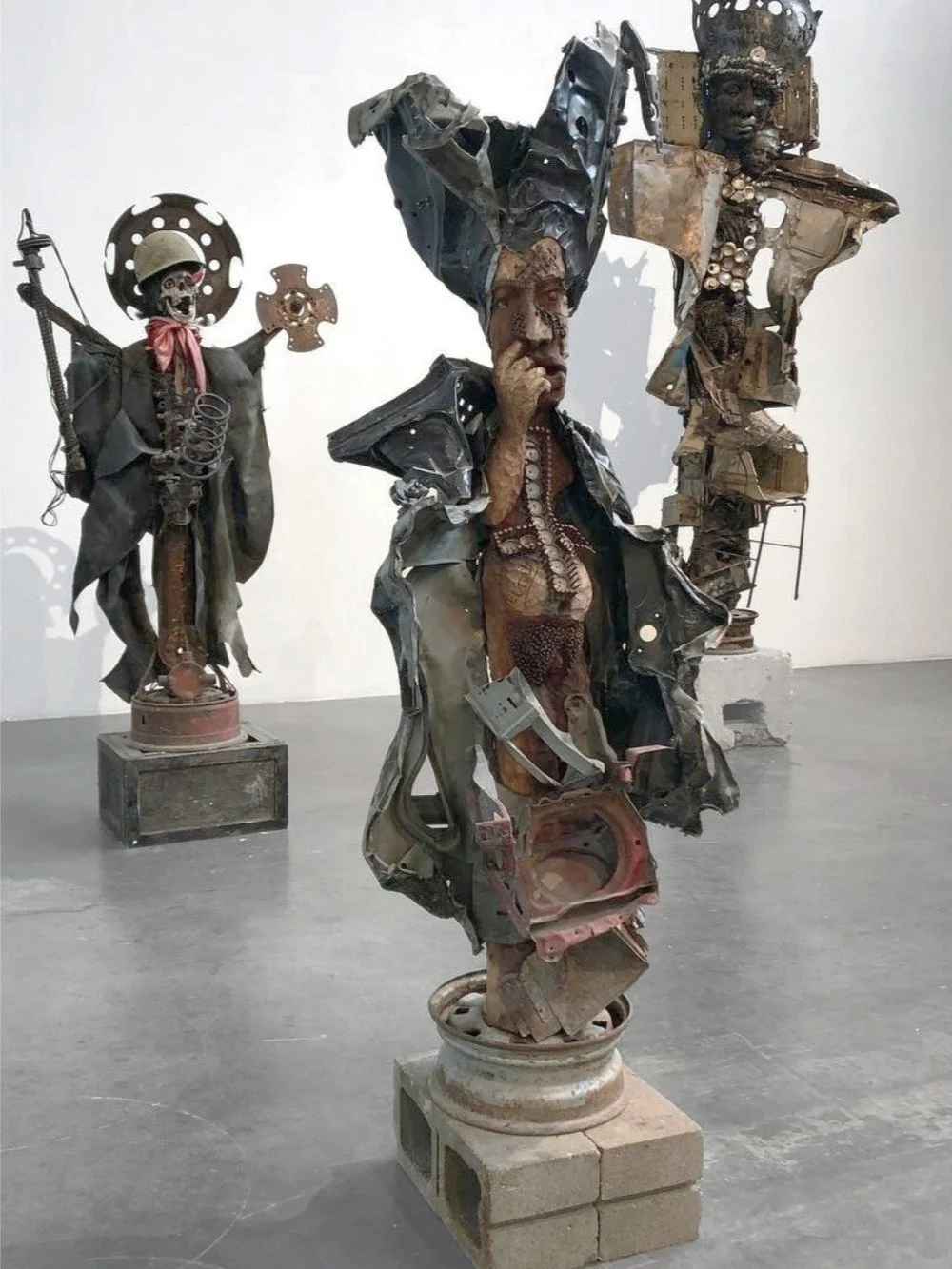
When presenting artist studies, cultural artifacts, or contextual documents, you may notice that these are often displayed in a separate manner. For one, they are usually behind a glass screen or protected beneath a transparent case. Whether intentional or not, this works to emphasize an object’s value and can even evoke a sense of fragility. Also, muted or darker-colored walls may indicate the “historical/cultural context” portion of an art exhibition. For example, Centre Pompidou’s exhibition Le Cubisme displayed 20th-century cubist artworks in a white cube-like setting while moments highlighting historical influences and cultural references were in muted rooms with artifacts including West African masks behind glass screens. There are debates whether this display style is limiting, anachronistic (portraying works in a way that associates them with imprecise or incorrect time periods), or if it even reduces the art of non-Western cultures to the periphery as “supplementary context.”
4) Black Box
© Ekaterina Bykovax
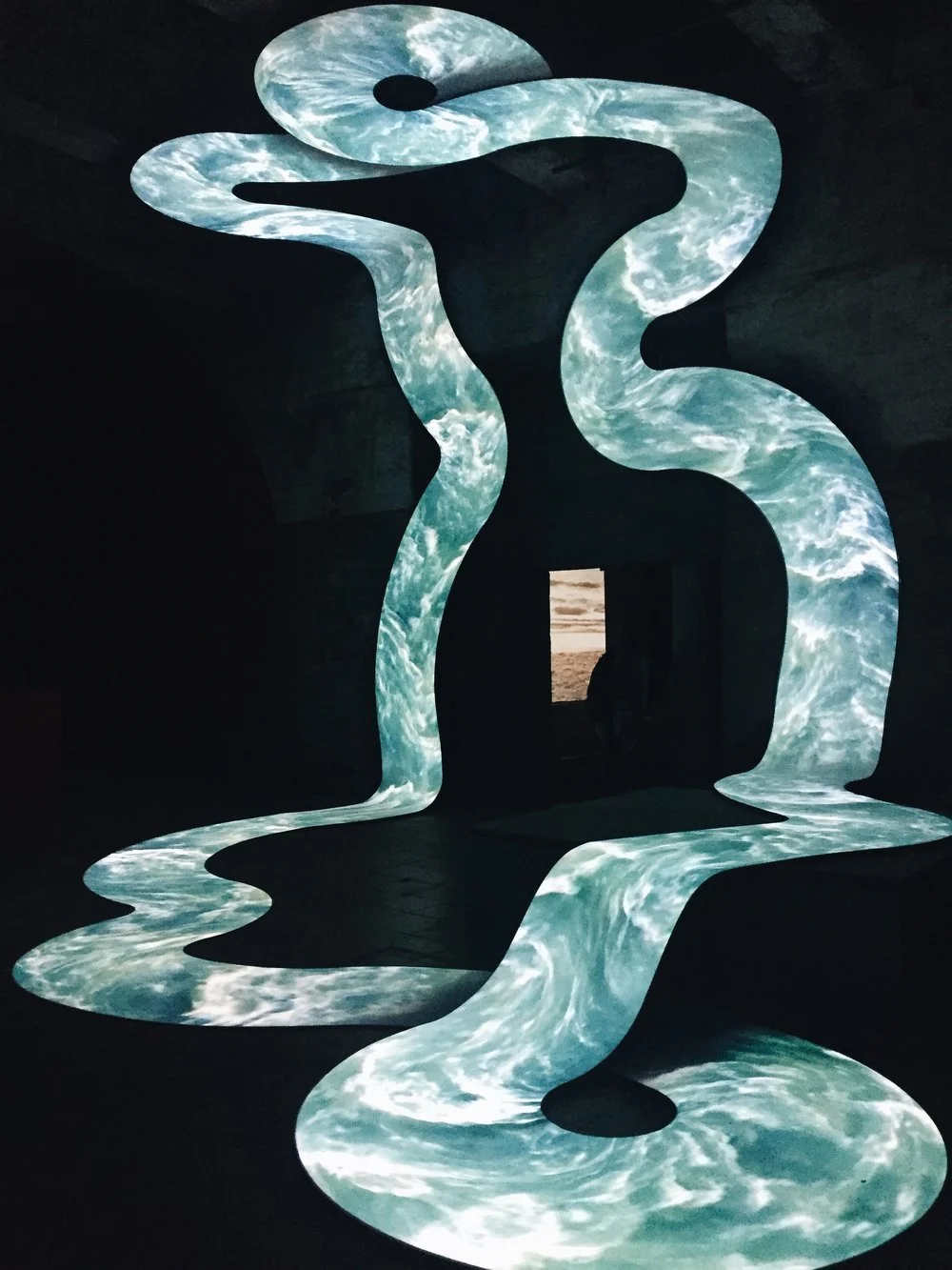
Also known as “black cube,” this display system is most commonly employed for films and video works. It consists of a space with minimal to no lighting, separated by curtains or a door. Sometimes, the black box is used to screen an accompanying documentary to an exhibition. It has also been increasingly used for digital art as well as exhibitions with an emphasis on technology. Artist Gretchen Bender, for example, creates installations made of stacked televisions playing animations, recordings, and simulations, and she utilizes the black box to emphasize her screen images while physically engulfing the viewer into her materialized world. Shows at ARTECHOUSE also come to mind, which often feature immersive installations and light/projection-based projects within a black box space.
5) Site-specific
Anselm Kiefer, The Seven Heavenly Palaces at Fondazione Pirelli HangarBicocca Milano. Image credit: © Claudio Divizia
Some of the most epic, photogenic, interactive (etc.) works are often site-specific, meaning they were created for a particular space and/or moment in time. Many of these works are commissioned by an institution, though much of land art and independently-made public installations fall under this category as well. If the art was displayed anywhere else, its meaning could change or dissolve completely. Olafur Eliasson’s Weather Project at the Tate Modern comes to mind. Or Kara Walker’s A Subtlety at the Domino Sugar Factory. I happen to love site-specific works, and have featured numerous on this site. See my post on Ugo Rondinone’s Seven Magic mountains here. See my post on Mark Bradford’s Pickett’s Charge here.


